The Power of Color in Design: Lessons from "Squid Game".
Let’s talk about the influence of color in design - starting with one of the most culturally impactful shows of recent years: Squid Game.
If you’ve watched the series, you’ve probably noticed how crucial color is - not just to the show’s atmosphere but also to its success. The vibrant, saturated tones of the sets create a stark contrast with the grim, violent storyline. This deliberate dissonance heightens tension and keeps viewers on edge, blurring the lines between innocence and horror.
Take the contrast between pink and green.
Players wear green tracksuits, reminiscent of school uniforms. The guards, on the other hand, don pink uniforms - a color often associated with innocence. But here’s the twist: their brutal roles and anonymous masks turn that innocence into menace. This visual metaphor encapsulates the oppressive system versus the individuals trapped within it.
Though Squid Game was primarily filmed in South Korea, some of its set designs were inspired by the La Muralla Roja building in Calpe, Spain. Designed by Ricardo Bofill, this architectural icon embodies bold, geometric forms and vibrant colors - a perfect match for the surreal yet oppressive aesthetic of the series.
As someone who’s spent years choosing color palettes for clients, I’m fascinated by how design decisions - rooted in psychology, culture, and geography - can create such powerful effects. For instance, the bright colors of southern Spain, often tied to warmth and joy, are used in Squid Game to unsettle and provoke.
But it’s not just the show’s storytelling where color plays a leading role. The marketing team behind Squid Game leveraged its iconic palette to build an empire. In TikTok, filters and masks inspired by the show allowed fans to embody its characters and symbols, turning every post into a mini billboard.
Netflix extended the franchise’s reach further with initiatives like Squid Game: The Challenge in 2023, a reality show with a jaw-dropping $4.56 million prize. By December 2024, they had released Squid Game: Unleashed, a mobilegame that kept audiences engaged long after the credits rolled.
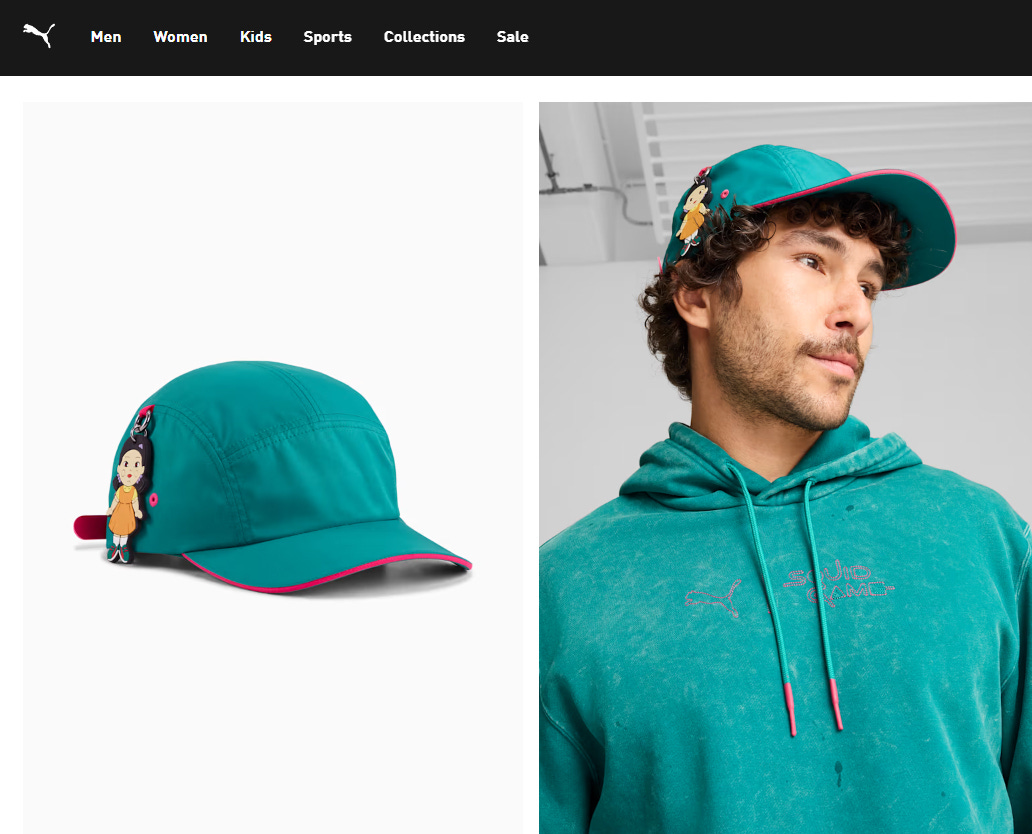
The branding didn’t stop there. Collaborations with major companies like Puma brought Squid Game into fashion. Tracksuits and sneakers inspired by the series became instant hits, transforming its once-ominous color palette into a badge of fandom.
And that’s the genius of it all. The colors that held us in suspense on screen have transcended into the real world, becoming instantly recognizable symbols of the show’s impact. They’ve evolved beyond their roots in Spanish architecture and Korean storytelling to define a global cultural phenomenon.
It’s a reminder of the power of design - not just to tell stories but to leave a lasting imprint on the way we see the world.


